Rachael Maniord
Product Management & Design Leader
The problem
After a few years of testing and learning with Future u’s credit product Fupay the next phase of Future u is ready to begin. Credit is just one small part of managing money and the need for new features and updated UX is essential in bringing the app inline with Fu’s vision: To help people live large & take charge of their money & achieve financial wellness. We do this by providing a smarter way to manage, save, spend and invest… all in one place.
Reviewing Fu App
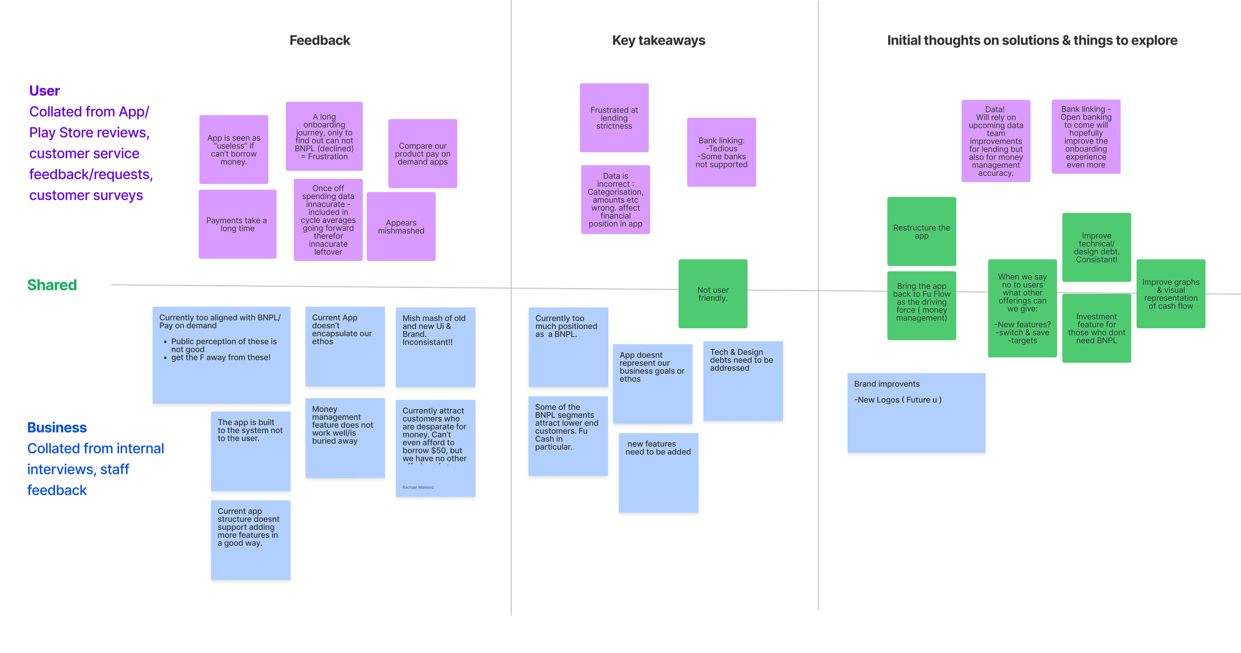
Initial steps were taken to review and document the Fu app through UX reviews, stakeholder interviews and user feedback from app reviews, customer service enquiries and surveys. A few common issues were immediately apparent:
The Fu apps features are a little mishmashed and can create some confusion on where to find things. If we are adding even more features it needs to be re-examined
IT does not yet align with the company ethos
Cash flow management feature is not the hero - buried away in the navigation
Is too aligned with Credit only (Buy Now Pay Later)
There is not anything to keep users who can’t borrow money
Competitor Analysis
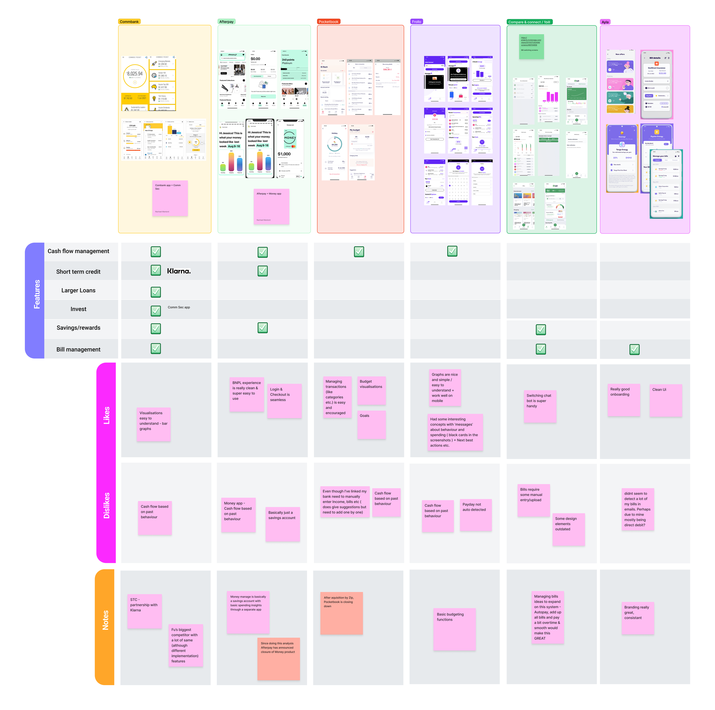
Fu’s competitors consist of a number of Banks, Buy Now Pay Later Companies and Fintechs.
Summary of findings
Overall the competitors apps UX/UI have a bit of an edge on Fu’s current app, having more seamless experiences and up to date UX/UI.
In terms of functionality not much has changed since Fu’s 2019 (See Flow) analysis of the products. The personal finance management tools are traditional budgeting products and backwards looking. Buy now pay later (BNPL) still remains largely for retail with larger lending amounts.
Data Driven personas
According to customer surveys & data analysis of our membership base, Fu has three main user segments. They are grouped by their financial position (What Fu calls “Affordability”): Low, Medium and High. Each user will have different needs and will want/need to access different features to manage their cash flow.
Developing a Product overview - Features
Given the three main user segments above having very different needs, We posit that it makes sense for the driving force of the app to be centred around Flow and the actionable insights are surfaced contextually based on the users needs at the time.
Information Architecture
Planning the app structure.
MVP - Design Phase 1 (In-Progress)
With such a large undertaking at hand to not only ‘re-design’ the Fu App, but also add more features, it was decided that the main focus initially should be the Home Tab & Money Management Tabs (Flow + actionable insights). These are essential to address the issues faced with the current product and would be able to be broken down into small development phases and releases.
It was essential when thinking about these screens to utilise what we have (with improvements based on my initial research) but also to think about a design that will work with Fu’s current feature set and have the ability to add more. I.e. One new feature is to Invest spare money which has not been developed yet.
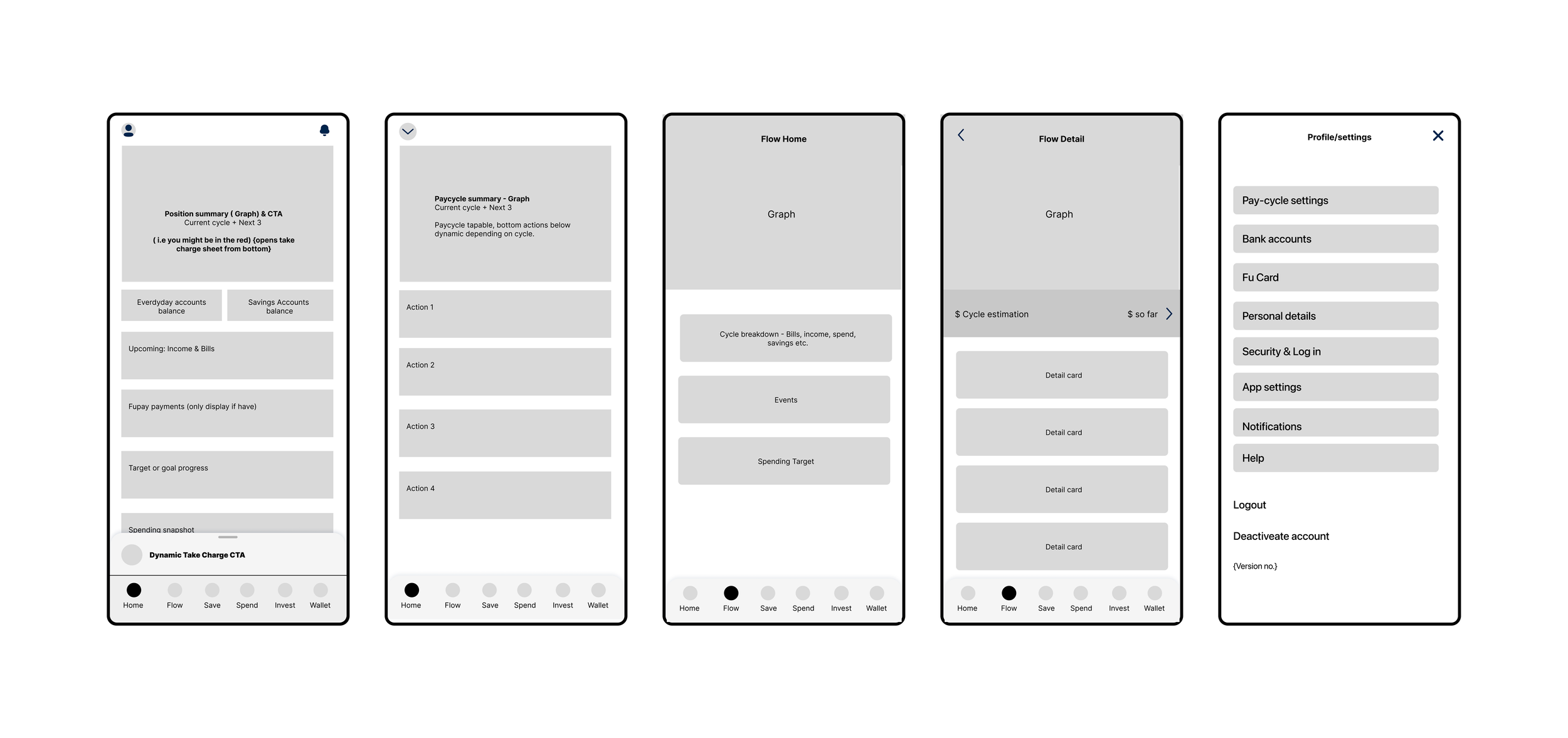
Starting with wires
Initial wireframes were developed to present across the wider product team + key stakeholders to make sure we were all aligned with the new vision for the app.
Design V1 (In progress)
The Home Tab
Users immediately see their financial position for their current and next three cycles. Immediate actions can be taken based on this position which include borrowing small amounts of money, finding savings, investing extra cash etc.
My Flow Tab
This is where users can see a further breakdown of their financial position, and start to build a bigger picture of their money: Which cycles are going to be heavy on bills. Where can I maybe save a bit? Did I actually spend that much last week?!
Users can:
View past and future cycles
View and manage their bills, income and spending
View and manage transactions
Set/track spending targets
Events & Transactions
These are the details of Bills, Income and Spending transactions. If Fu hasn’t got it quite right users can recategorise and edit them. They can also manually add a transaction to an event or create a new bill/payday.
What’s next?
Continuing to develop all of the different states and flows of the first two tabs & developing a testing framework to run some initial usability tests to test and learn from these initial designs.
Some initial things to explore:
Does the language used around the app make sense. i.e Flow, leftovers etc.?
Do users understand their financial position from the information displayed, and is it helpful?
Overall is it easy to understand (It’s pretty complex and trying to achieve a lot)?


